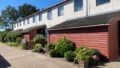
In Japan, it has become popular to manage the colour of building exteriors and public infrastructure with the numerical colour system called “the Munsell color system”, mainly by local governments. However, in Europe, I have heard that it is not popular to control colours for building exteriors and public infrastructures with such a numeral value. This is because I was so surprised that the colours of various kinds of public infrastructure were exactly the same in Aalborg City, the northern part of Denmark. As I became so curious about it, I sent an email to Aalborg Municipality and asked how these colours had been managed. Their answers helped me develop colour analysis and get some findings about colours and outdoor advertisements (Note 1). I would like to share them and made this article.
Public infrastructure and outdoor advertisements using the dark blue
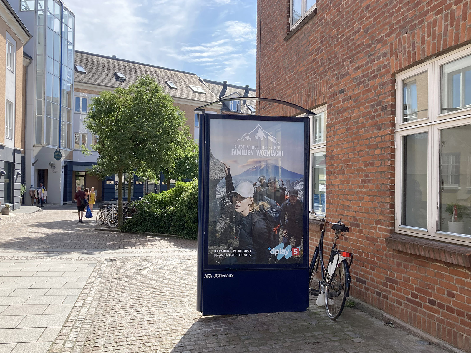
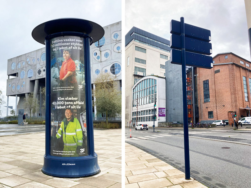
This dark blue colour is used for bus stops (bus shelters), advertising towers, advertising boards, road signs, etc., creating a consistent cityscape.
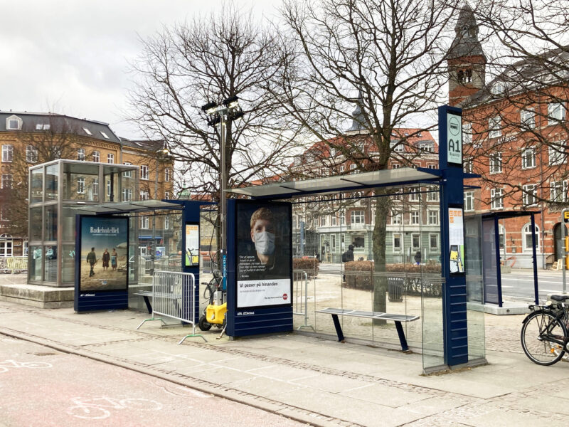

In Japan, when measuring colours for objective data, it is common to use the “Munsell color system” consisting of three attributes: hue (i.e. Red, yellow, etc.), lightness (from black to white), and chroma (vividness). I measured the colours of these, and the result was “5PB (abbreviation for “Purple Blue”) 2.0 / 2.0”, which means a fairly dark and calm blue colour.
Townscapes led by advertising agencies
After measurement, I was pretty sure that these colours must be controlled by Aalborg Municipality. This is because it’s very common in Japan. Therefore, I sent an email to ask how they control colours – but my assumption was wrong.
I got a reply from an architect working at Aalborg Municipality. To summarise,
・ Colours of many of the public infrastructures are managed by the firm AFA JCDecaux. The Municipality or other companies pay to place advertisements in frames provided by AFA JCDecaux.
・Colours of other public infrastructures are managed by the city using the RAL color chart. However, it is difficult to manage with a colour chart, since the colour code can look different on various kinds of materials, with different surfaces, shine etc.
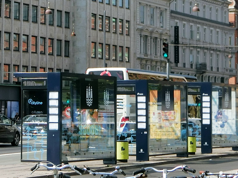
After I checked the photos and AFA Decaux’s website, I confirmed that the frame of the bus shelter and the advertising tower I saw in Aalborg belonged to the advertising agency, AFA JCDecaux.
AFA JCDecaux works in Denmark and consists of the JCDecaux group, which is based in France and is a global advertising agency operating in more than 80 countries and in more than 4,000 cities (AFA JCDecaux, n.d.). In 2010, it became the world’s largest outdoor advertising company (JCDecaux Group, 2011) (Note 1).
In Denmark, the colours for outdoor advertisements seem to be either dark blue or dark grey (AFA JCDecaux, n.d.) (Google, n.d.), so it is supposed that Aalborg Municipality arranges colours for public infrastructure in order to use the same colour decided by the advertising agency. In Japan, it is normally local or national governments that decide specific colours or rules for colours to enhance the locality in a wide area, such as across the city or country. So I found it very interesting that advertising agencies lead the colour townscape of the region.
Additionally, in Japan, it is common for local governments to prepare a frame for local maps. However, I realized using the pre-maid frame helps to create consistent townscapes with less effort. (Decaux group is also active in Japan as MCDecaux (Note 2), and there are some cases to put local maps in the frame of MCDecaux.) (MCDecaux, Inc., n.d.))
Global company’s local considerations
On AFA JCDecaux’s website, they say “to ensure the functionality and aesthetics of our street furniture and outdoor equipment”, “the equipment should be discreet and transparent”, and “the design is uniquely tailored to the character of each city” (AFA JCDecaux, n.d.). Initially, I had expected there is a wide design variety depending on cities. However, from the AFA JCDecaux’s website, Google Maps, and photos, etc., it became clear that design arrangements for outdoor advertisements in Denmark were very sensitive. They are slightly different in shapes, and there were only two choices for its colour – dark blue or dark grey (AFA JCDecaux, n.d.) (Google, n.d.). However, from this research, I found that dark blue in Aalborg represents its locality, since I have never seen dark grey bus shelters or outdoor advertisements in Aalborg, and dark grey ones are the mainstream in Aarhus and Odense, and both colours were seen in Copenhagen (Google, n.d.).
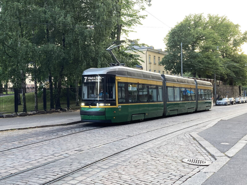
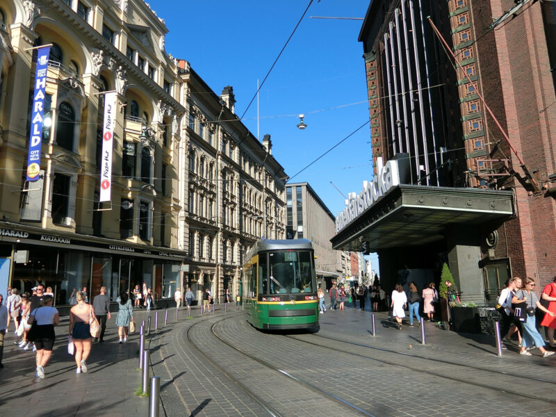
We can see the JCDecaux group’s consideration for locality through their designs in other countries. The JCDecaux group also work in Finland as JCDecaux Finland (JCDecaux Finland, n.d.) In Helsinki, the capital of Finland, I felt that the colour of bus and tram shelters reflects its locality. There are so many multi-story stone buildings built between the 1890s and 1910s (Deckades of Finish Architecture 1900–1970,2020) and pavements were mainly made of cobblestones. These stones are generally very calm yellow, and the colour of the shelter was green, which is close to yellow in hue, in other words, colour wheel. (It is so regrettable that I did not have a colour chart this time.)
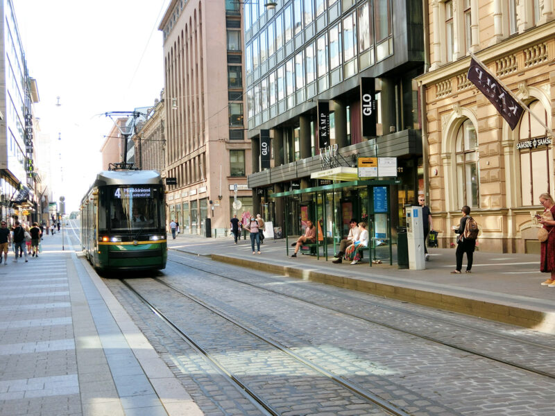
Also, as shown in the picture, yellow and green are used for the tram itself. Therefore, when a tram runs between yellowish stone buildings passing some green shelters, the combination of yellow and green is emphasized, and you can feel locality as well as vibrancy in motion.
In addition to this, the design of the advertising board was different from one of Aalborg, with an organic shape and yellow colour.
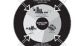
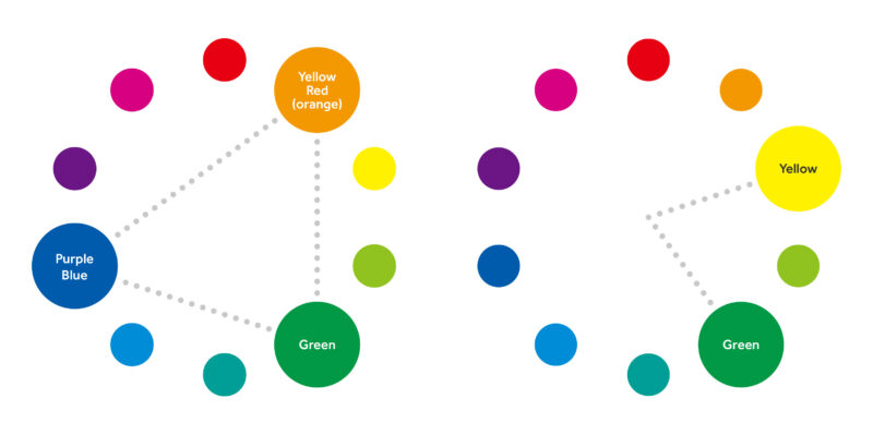
When we think about the colour scheme (relationship of colours) of buildings and other public elements in Helsinki, it is clear that there are “Analogous (similar) Color Schemes“ consisting of yellow and green. (See right in the figure below)
In the same way, considering the colour scheme in Aalborg, it could be said that it is a Complementary Color Scheme, which means opposite to each other. This is because blue is found in public infrastructure and orange (Note 3) is found in bricks of buildings, emphacising each other. Then, I wondered why they didn’t use the exact opposite colour of orange (light blue), instead of dark blue.
Therefore, I remembered that Denmark is very good at agriculture and rich in nature. So, even in the city centre, you can see many plants and trees (This can be said especially in Aalborg. This is because Aalborg is the fourth biggest city in Denmark, and I feel that there are not many commercial buildings but more greenery in the city, compared to other major cities in Denmark). Then, when I consided the colour scheme again adding the green of the greenery, the blue from the public infrastructure, the orange from the bricks, and the green of the greenery created a colour scheme named “Triad Color Scheme” making a triangle in a colour wheel (see the left figure below). Overall, the dark blue colour is the colour that harmonizes with the colour of historical buildings and greenery in the city.
Summary
When I learned that one company manages most of the outdoor advertisements instead of local governments, I initially feared that the locality might become weak. However, taking into account that numerical colour management systems, such as the Munsell colour system, are not so common in the public in most other countries, it might be effective that one company organises multiple types of advertisements according to certain rules in order to create consistent cityscapes.
In addition, when I researched the JCDecaux group, I was so impressed that they decide on “local colours” with a fairly wide perspective based on stones and soil, which consist building materials, and landscapes. Contrary to this, in Japan, sometimes locality are too emphasized in the design for public infrastructure (for example, a bright orange bridge because mandarine orange is famous in the area). One reason is that sometimes a city competes with the surrounding cities and emphasises its uniqueness. So I found that if we decide on local colours based on natural colours, we do not have to create very different designs from surrounding cities. I thought that it is a global company, such as the JCDecaux group, that would be able to find local colours with wide perspectives and make sensitive arrangements within the local colours.
Before I left Japan, I had heard that the JCDecaux group created outdoor advertisements considering townscapes, but I have not expected that they made such a huge contribution to cityscapes in Europe. In Japan, recently “townscapes utilizing outdoor advertising” attracts attention. Generally, it tends to encourage large-scale advertisements to create a vibrant atmosphere such as New York City and Shinjuku Ward. However, I recognized that it is possible to show localities with discrete and consistent colours of outdoor advertisements and public infrastructure.
I also recognized the importance of a wide perspective and collaboration between different institutions for actual design and design system.
Last but not least, I was so impressed that the person in charge at the Municipality politely answered questions from a mere one citizen. Although the city size might be related, I became more and more fond of the Aalborg.
Annotation
Note 1: The definition of outdoor advertisements is different between Japan and other countries (ex. mainly in Europe and America). In this article, I use the word of “outdoor advertisement” based on the broad definition. In Japan, it basically means advertisements installed “outside”, so normally, advertisements installed in the windows of shops are not included in the definition of outdoor advertisements (however, recently more and more local governments arrange their definition to recognize these as “outdoor advertisements” and try to control them because these advertisements apparently provide information to the outside and affect townscapes a lot). On the other hand, overseas, all advertisements outside the house are basically considered outdoor advertisements (or out of “home” advertisements). Therefore, not only street equipment such as advertising boards and street furniture, but also advertisements in stations are included in outdoor advertisements. (Gino, 2018)
Note 2: In Japan, MCDecaux Co., Ltd. was established as a joint venture with Mitsubishi Corporation in 2000. It handles advertisements for commercial facilities, share cycles, and bus shelters. (MCDecaux, Inc., n.d.)
Note 3: Although there are some variations, in general colours concentrate on a specific range – the hue is 0-5YR (Yellow-Red or orange), lightness is 4-5, and chroma is 4-6. According to the city, they have colour restrictions for building exteriors in local plans, but those are rarely used. Instead of using colour restrictions, they mentioned materials a lot.
References
AFA JCDecaux (n.d.) “ABOUT US”, [online]. Available at: The JCDecaux group | AFA JCDecaux, (Accessed: 7 Feb 2021)
AFA JCDecaux (n.d.) “Design”, [online]. Available at: Design | AFA JCDecaux, (Accessed: 14 Feb 2021)
JCDecaux Finland (n.d.) “JCDecaux in Finland”, [online]. Available at: JCDecaux in Finland | JCDecaux Finland, (Accessed: 15 Feb 2021)
Decades of Finnish Architecture 1900–1970 (2020) [Exhibition] . Arkkitehtuuri museo, Helsinki. the permanent exhibition
Gino Sesto (2018) “What Is Outdoor Advertising and Why Is It Important?”, [online]. Available at: What is Outdoor Advertising and Why is it Important? | DASH TWO, (Accessed: 14 Feb 2021)
Google (n.d.) “Aarhus”, [online]. Available at: Banegårdsplads – Google Maps, (Accessed: 15 Feb 2021)
Google (n.d.) “Copenhagen”, [online]. Available at: 7 Bernstorffsgade – Google Maps, (Accessed: 15 Feb 2021)
Google (n.d.) “Odense”, [online]. Available at: Østre Stationsvej – Google Maps, (Accessed: 15 Feb 2021)
JCDecaux Group (2011) “JCDecaux: number one outdoor advertising company in the world”, [online]. Available at: JCDecaux: number one outdoor advertising company in the world | JCDecaux Group, (Accessed: 7 Feb 2021)
MCDecaux, Inc. “Town Media”, [online]. Available at: 街メディア | MCDecaux, (Accessed: 16 Feb 2021)
MCDecaux, Inc. “About MCDecaux, Inc.”, [online]. Available at: エムシードゥコーについて | MCDecaux, (Accessed: 16 Feb 2021)